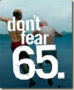
An expurgated email:
Hi Chuck,
 I work for Bellevue-based (that'd be Washington State, Seattle area) Symetra Financial, and as we were developing our new ad campaign geared toward retirees, I came across your blog …
The Web site we’ve developed: www.dontfear65.com.
 We’re focusing on empowerment and optimism, as opposed to fear mongering, and in doing so we hope to change the mindset around retirement ...
The theme of the campaign is highlighted in a couple of fun videos that depict seemingly ordinary Boomers before a crowd of retirees, rallying them to face turning 65 without fear:
http://www.dontfear65.com/#/videos/1/
http://www.dontfear65.com/#/videos/2/
Well … these folks are practically down the street from me – so I’d better be nice.
 Actually, I got a kick out of the site. The videos are cute. I’ll take cute over pandering or condescending any day.
Gee. Free consulting. This is a big chunk of what I do for a living. Meaning, I don’t do it for free. Or, I do do it for free because I’m doing it now ...
A few observations and suggestions:
I’m not a big fan of flash microsites. This one is simple and inviting, however.
The graphics and layout are fine for the landing – but deeper in, the wishy-washy color contrasts and spongy fonts are dreadful for older eyes. Also, a good rule to remember: If you think you need a text resize widget, that means only one thing - the text is too small. Bump it and forget about a silly resizer.
Things look much better when you fly out of flash hell and land on a PDF. True - it's kind of boring, not very fun and sexy in PDF-land (it could be with an extreme makeover), but at least my eyes don't hurt and my pointer isn't fumbling around trying to grab and pull on that flimsy scroll bar.
Now I’ve done my good, neighborly deed for the day. Back to being cranky.
 It is with great pleasure to inform you that our book The Silver Market Phenomenon: Business Opportunities in an Era of Demographic Change has finally been published by Springer this week. You will receive your author copy from Springer soon. I am attaching the book flyer (PDF) for your reference. Please feel free to use it to spread the word and promote the book.


